iFood is the largest food delivery
player in Brazil, we have a help
center for questions or problems
for our Restaurants partners.
Filter the maximum number the customer service through help
content, in order to directly
decrease our contact rate indicator.
Implement a search feature to
make it easier for users to find
content and measure how useful it
is without an evaluation survey.
Worked with PM to construct
product solution and totally
responsible for experience,
interaction and interface.
Access from desktop to view the complete project.
Help center in
the Restaurants
operation
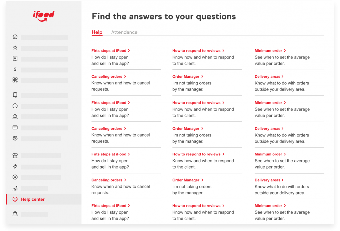
Restaurants have a system with several options to manage your business on iFood. Our help area is divided into two tabs, help content and service request.
In the content tab we have dozens topics with information that can help the user in case of doubts or problems with the operation of his restaurant. Our main objective with this is to contain the number of attenuation requests through the contents.
Why is it important for the business for users to access help content?
– Reduce contact rate – Improve CSAT and NPS indicators
– Decrease service cost
– Prioritize care for urgent cases
What situation
do we need to improve?
We needed to get users who access the help page to interact more with the content. Through data we observed that the vast majority of users went straight to the service tab to try to talk to someone, but there is often content that can quickly solve the problem.
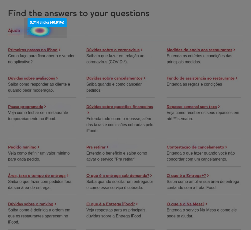
The example below of a heatmap in Hotjar with 10 thousand hits, exemplifies how well users have not interacted with the content, this is the main indicator that we want to change.
Talking with
users, applying
card sorting
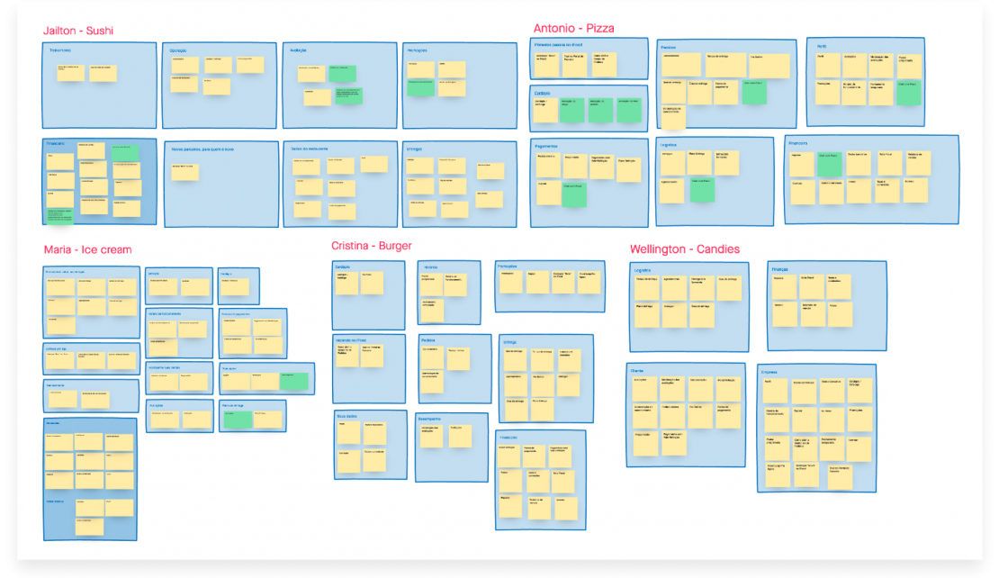
To better understand the reason for this behavior, I talked to 5 users to map their relationship with the help area.
Complementing the questions, we also did a card sorting exercise, where each user could freely organize various subjects in categories they loved. The aim was to understand people’s mental model, which made sense in terms of taxonomy and content disposition and to relate this to the low access compared to the organization of the contents at that time.
Analyzing the results to find principal terms
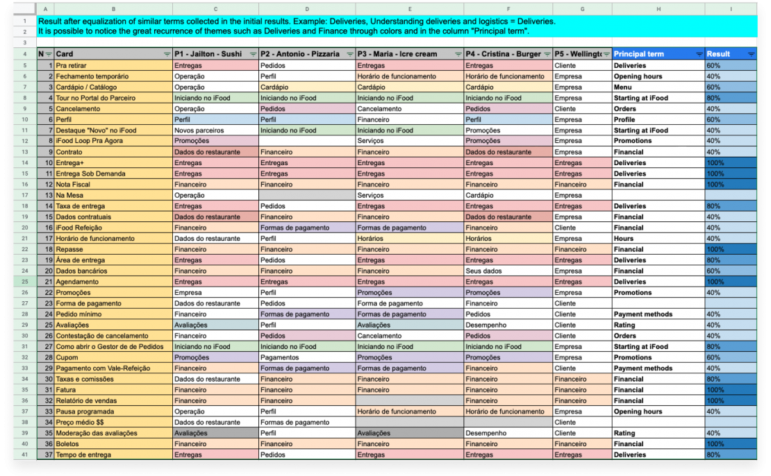
To extract results from card sorting I first analyzed the results individually per user to find the predominant terms, then equalized similar terms between results from different participants. That way we have a more quantitative view of which organization each person assigns to each of the subject cards.
Mostly terms such as deliveries, finance and orders prevailed, pointing us to a path with fewer categories of content but with great subjects that show more value to users, so that we can retain direct access to service.
Product evolution and definitions
1. Implement a search field to facilitate finding content.
2. Measure the quality of content through user evaluation survey.
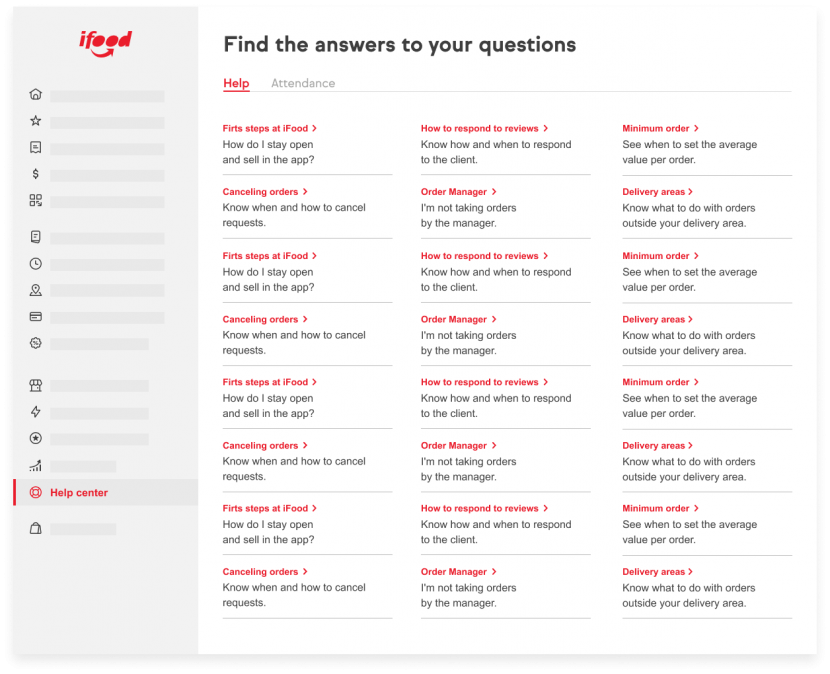
Change in the help area approach to content on demand.
Drag on side to compare the before and after ➔
I use one free component plugin, if her don’t appear at first, reload the page please. 
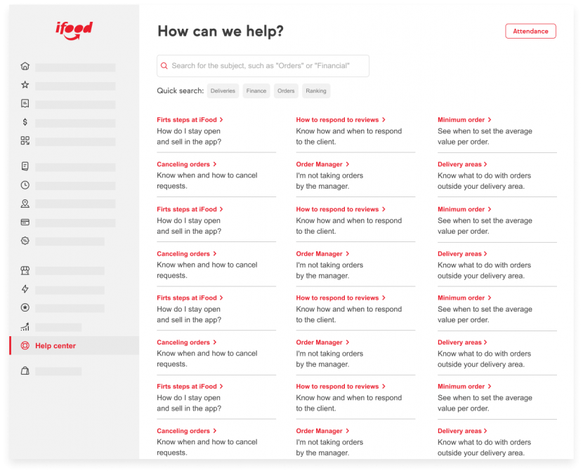
1. Implementing the search for content
As simple as it may seem we did not have a search for content, the main objective of this implementation was to give users more possibilities by facilitating the gathering of information and to have visibility of the type of content that people most need.
As a feature we have an open field for searching and also the “quick search” with more important terms that appeared in the card sorting exercise. This is a search with results already predefined for that term.
2. The content evaluation by user
A content only retains in fact if it is really useful to the user, that is, to actually solve their problem. If the search made it easier to find information, we needed to have visibility of how effectively each content was performing at the level of user satisfaction.
The content evaluation gives the user the possibility to express his or her negative or positive opinion, and even complement it with a comment. The main objective with this is to have analytical data of usefulness of each content, with that we have visibility of what information we need to improve.
Product data results
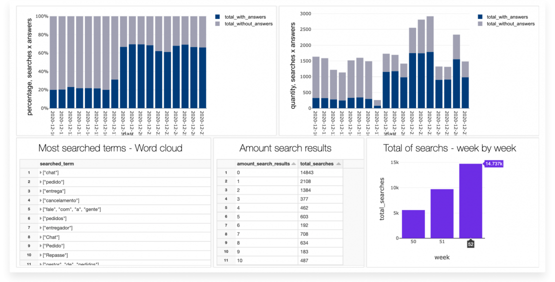
Using Faster events and Databricks dashboard to analyze the features performance and users behavior.
Users are looking for help content
Users are using the search component, the number has increasing week by week, now we are know what the principal informations they are looking for. We are also evolving in the amount of results per search, decreasing empty searches.
With these data we already know where to stay in improving nomenclatures and displaying content related to the most searched terms.
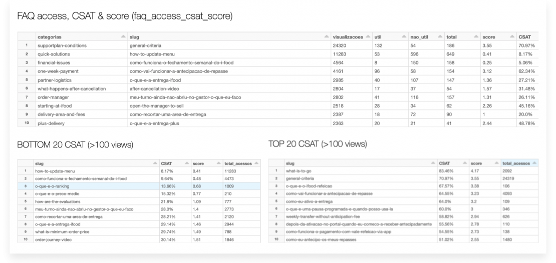
Score evaluation per content
Now we have an overview of data for each content, with the total number of accesses and the number of negative evaluations, it is possible to create a score that gives us visibility and differentiation of the usefulness between the contents.
In this way, we can focus efforts on more poorly evaluated content, with worse scores as shown in the table “Bottom 20 CSAT”, and monitor the evolution of their performance with each update of information.
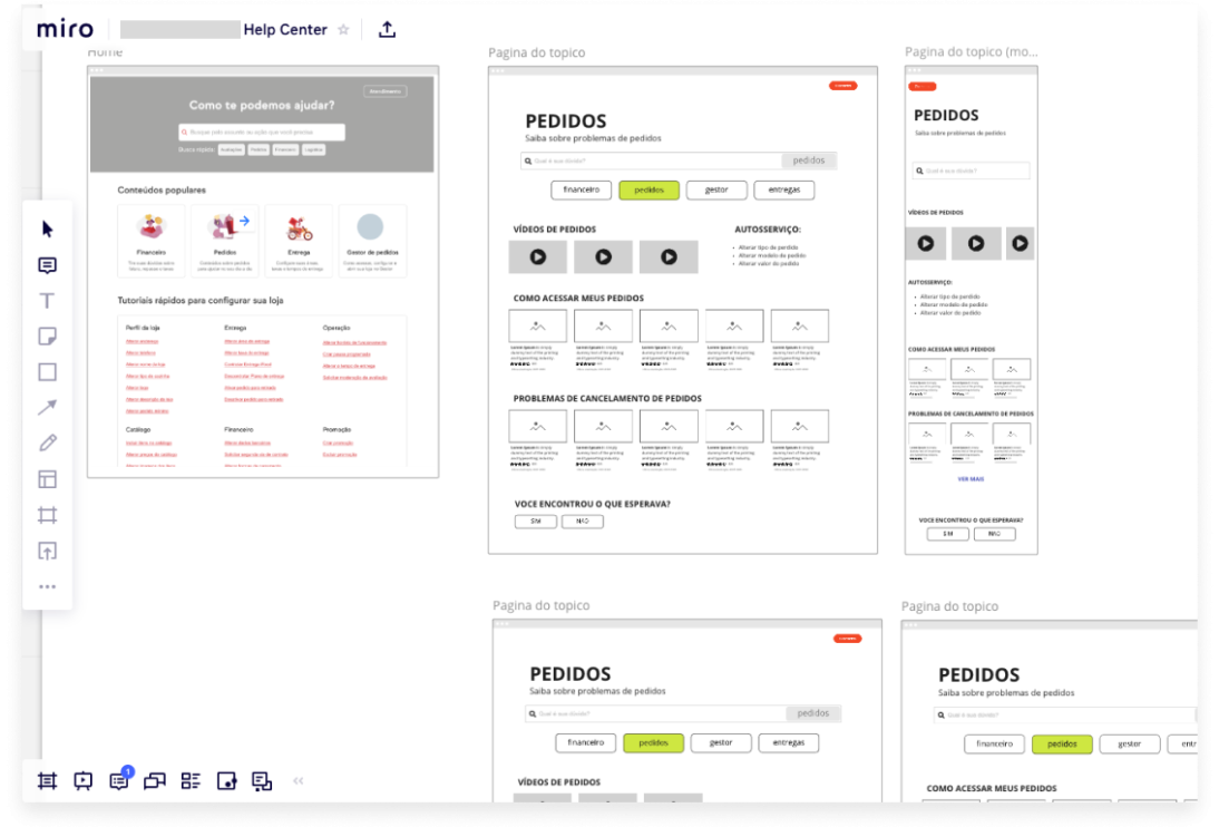
<span data-metadata=""><span data-buffer="">Visual evolution to delivery new Help Center experience
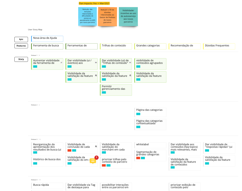
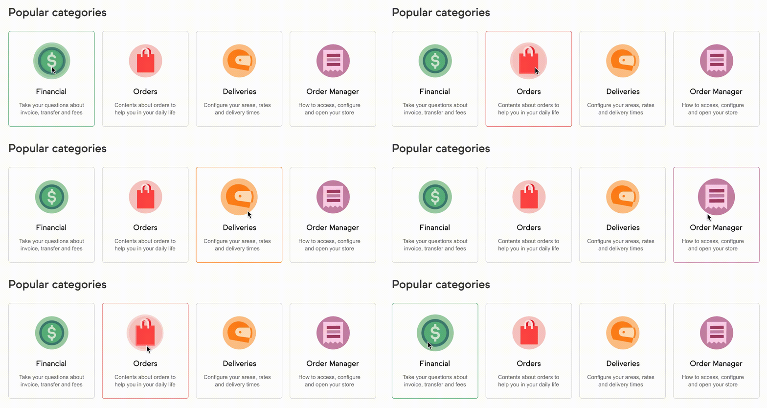
After the results of the first experiments had validated the idea that users search for content if they have a good experience doing it, we started to explore a new visual structure for the help center. We use the learnings of research and data analysis as for example the Popular Categories organization and video as a type of content.
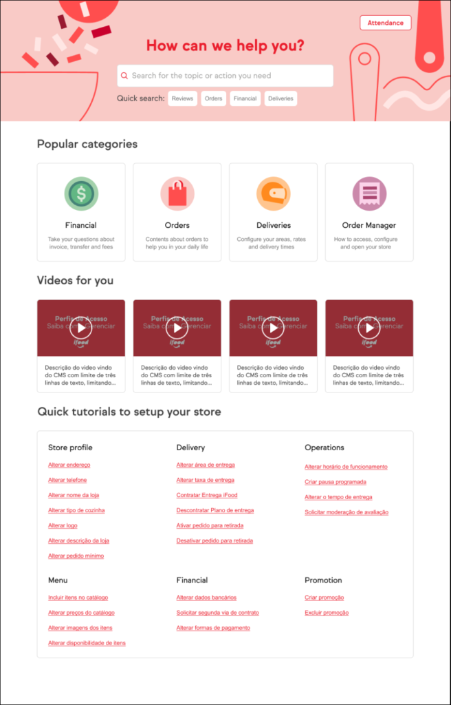
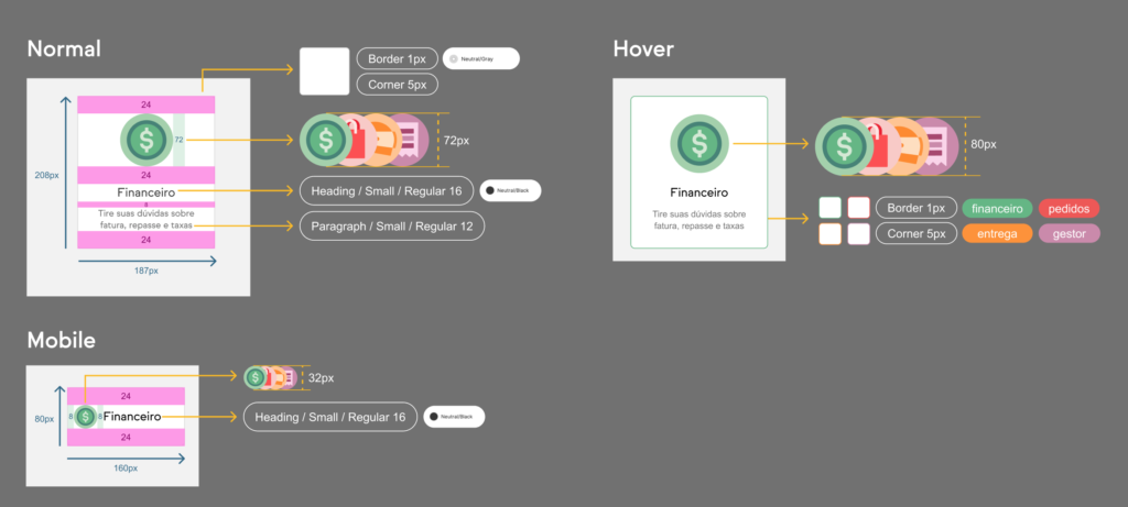
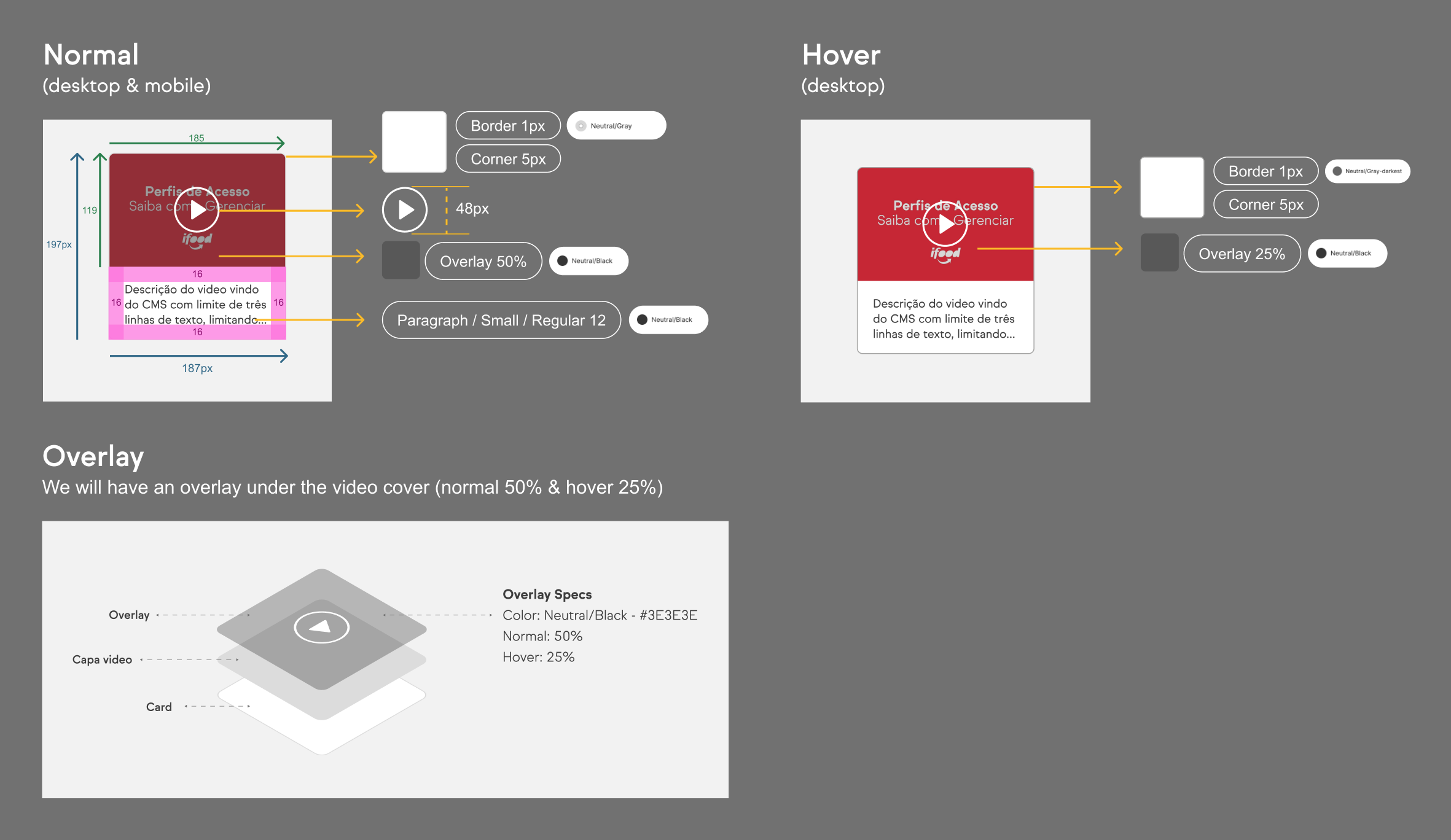
Interaction prototype's & Handoff especs to developers

Learnings and next steps
The primary learning is always to prepare product solutions so that they bring analytical results, this brings an incredible view of the results and also for monitoring and better understanding of the users behavior.
As next steps I intend to evolve the search engine, make it more intuitive and assertive. Restructuring the entire help page, once we have a good search engine, we don’t need to display all content at the same time, reinforcing the on-demand content approach; using space for large focal subjects.

